Visual Brand Identity
Across Bruges
July 2025
Across Bruges is a walking tour company built on their manifesto of “in-tour-tainment”, a mix of history and entertainment. While the tours already stand apart from traditional guided experiences, the goal was to create a visual identity that captures the brand’s playful spirit and appeals to travellers looking for something more engaging than the average city tour.

Logo Direction
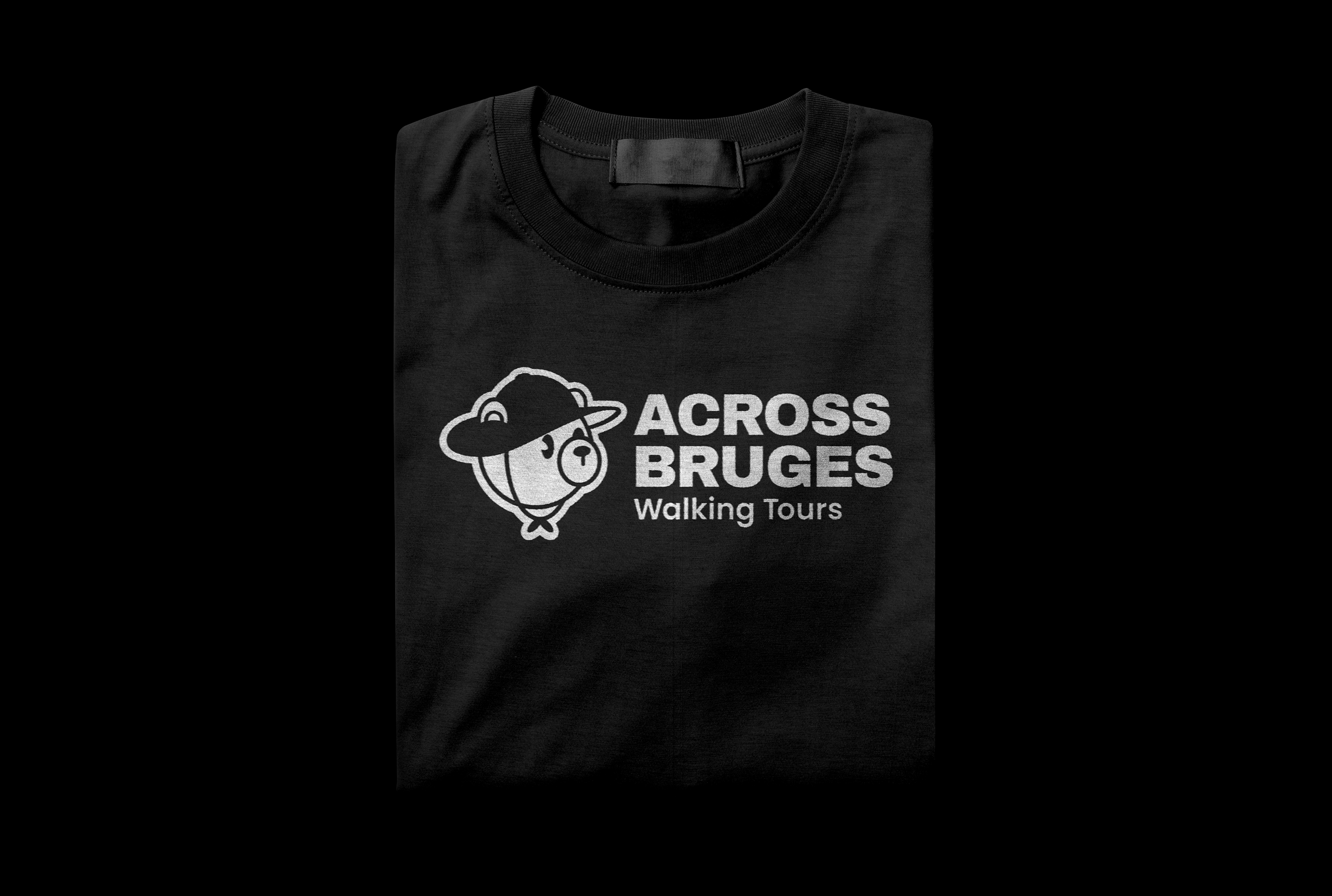
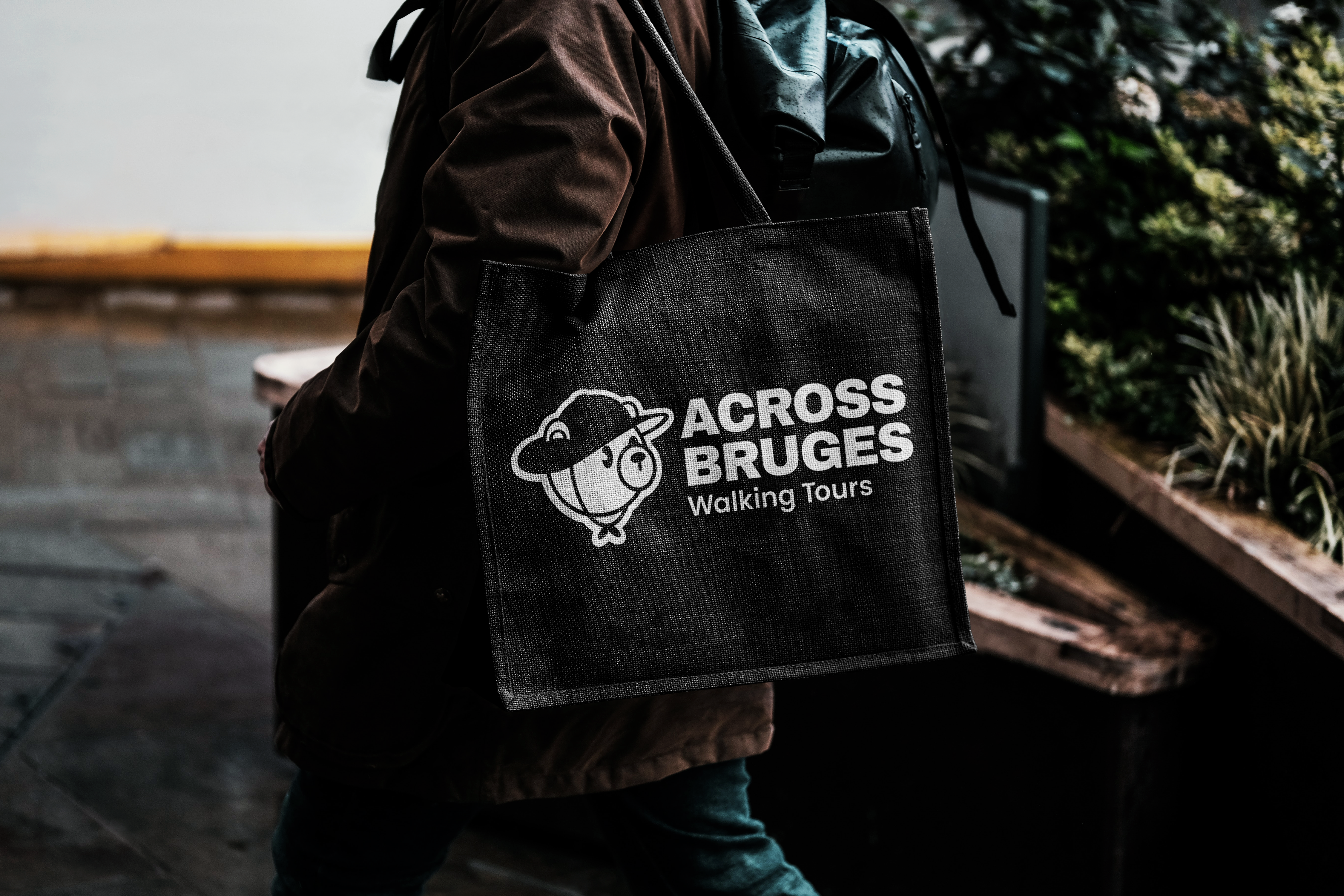
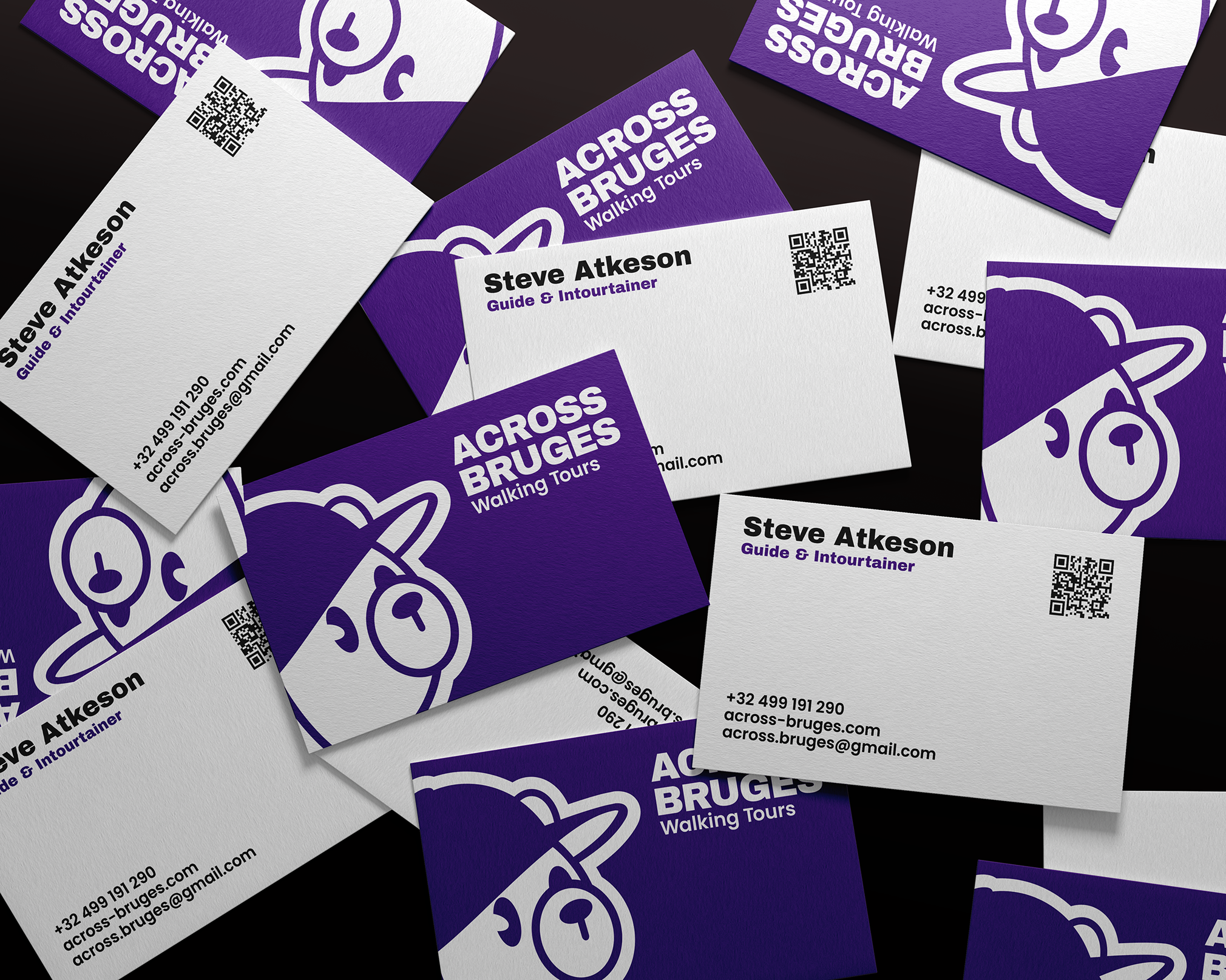
According to legend, one of Bruges’ first inhabitants was a bear. This became the foundation for the brand’s mascot. A bold, all-caps wordmark ensures clarity and strong visibility from a distance.
Color Direction
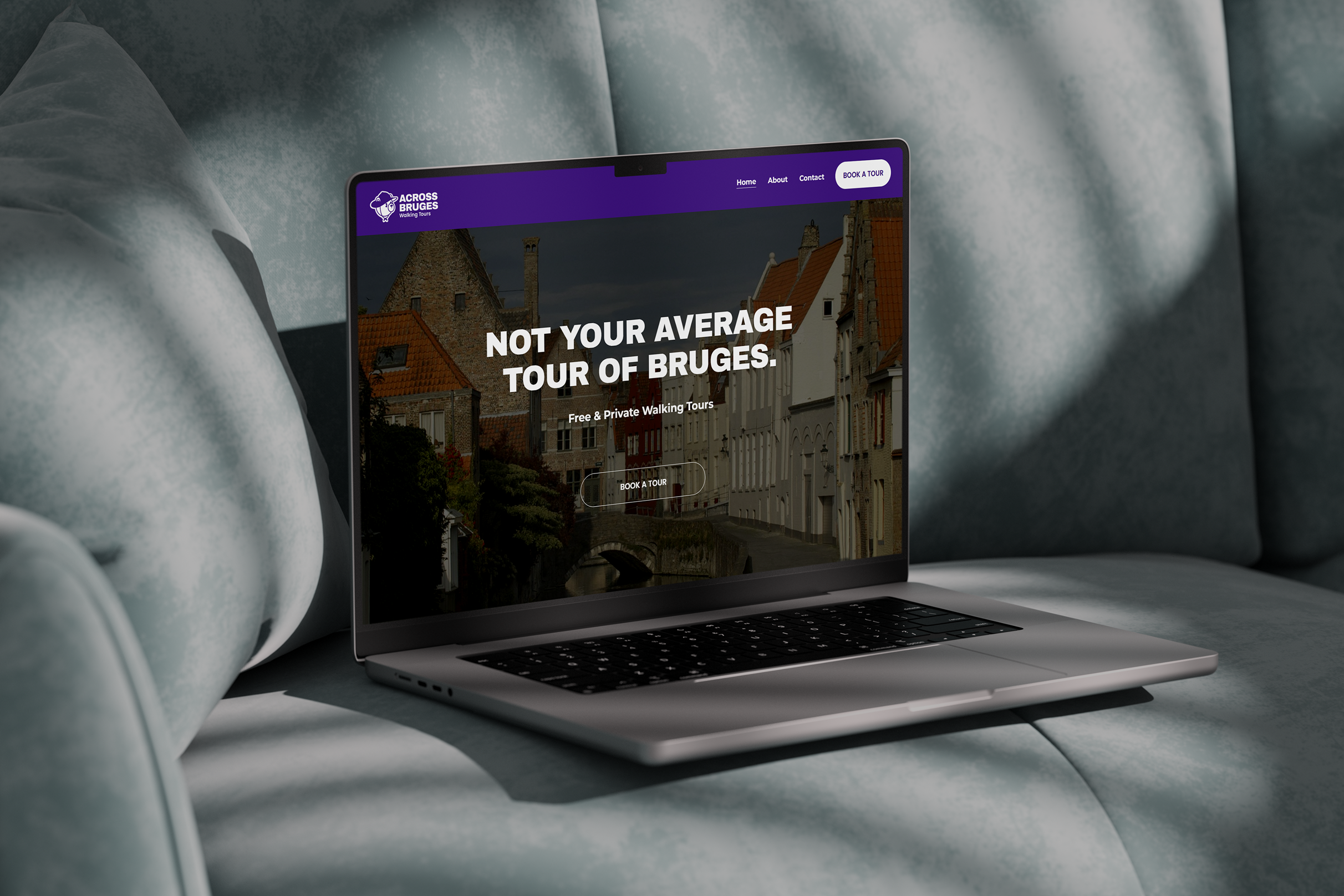
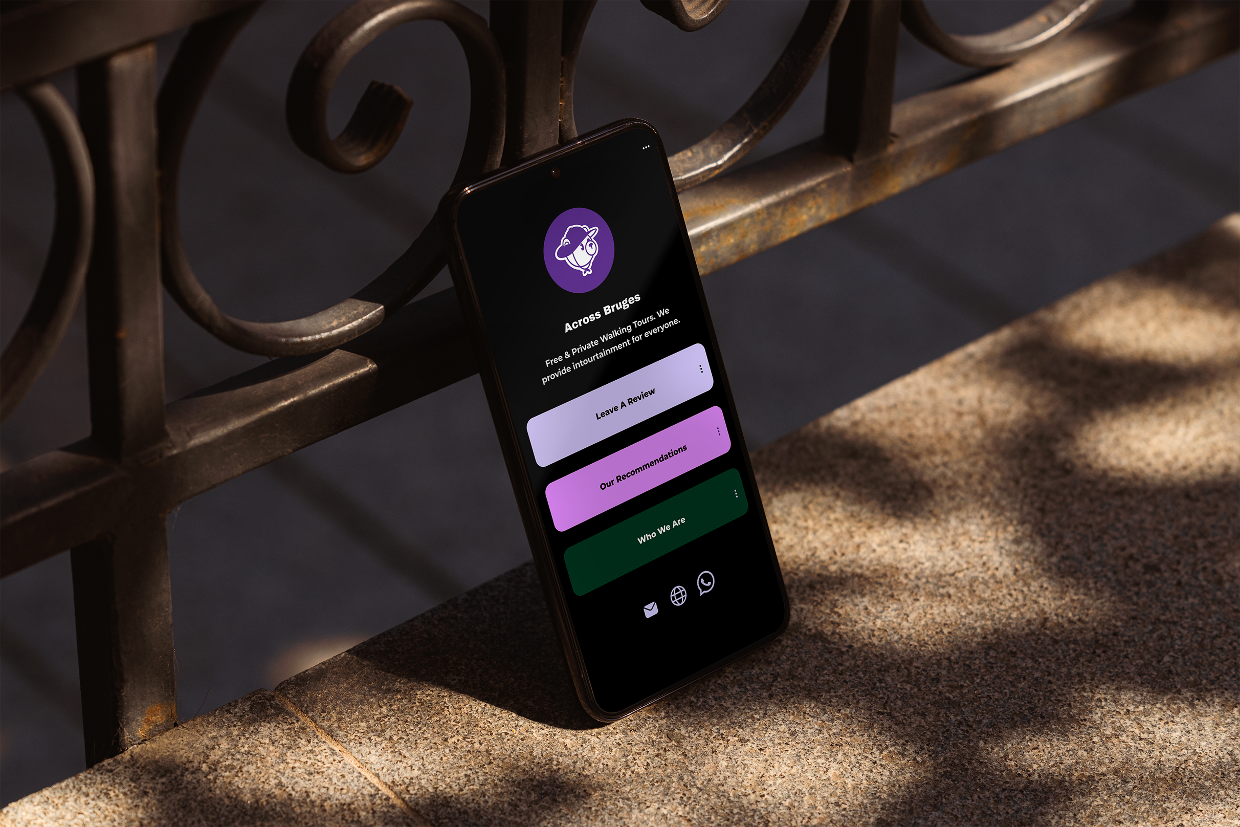
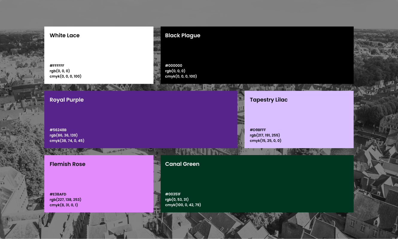
There’s an unwritten rule among guides that no two companies should use the same umbrella colour. We chose purple for its playful, slightly unexpected feel.
Fun fact: in medieval times, it was associated with status and worn by those with privilege and flair. Supporting tones were added to balance the palette, keeping it fun but grounded.